
Sahale Snacks
Taking a brand to the next level
Fig, mango, lemongrass, black pepper. These are just a few of the gourmet ingredients that make Sahale Snacks Nut Blends unlike anything else in the snack aisle. Launched in 2003, Sahale Snacks was founded on the idea of creating healthier and better-tasting snack products. After only a few years, the company had built up a loyal customer base with large-scale retailers such as Target, Whole Foods and REI. With their eye on further growth of the brand and the company, Sahale Snacks needed to improve shelf presence and build stronger connections with consumers. They needed a more approachable and readable design, a revised naming structure, and a consistent brand architecture that could be extended to future product lines.

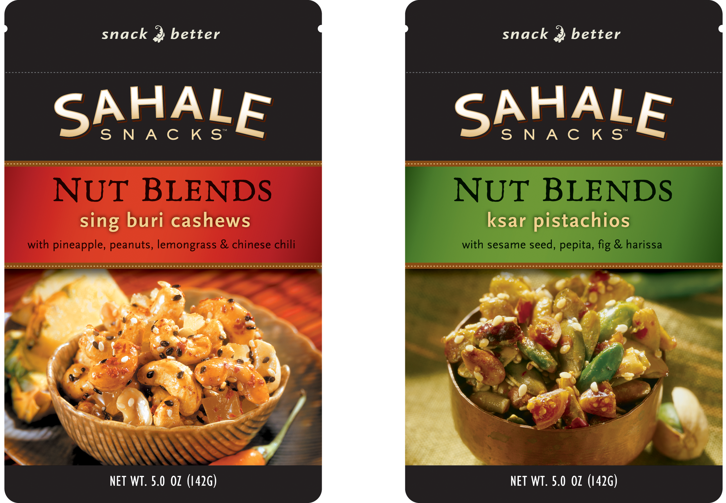
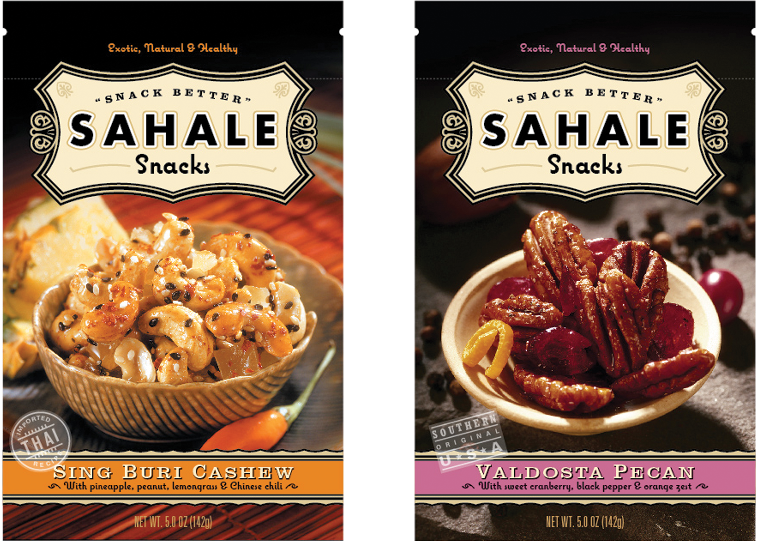
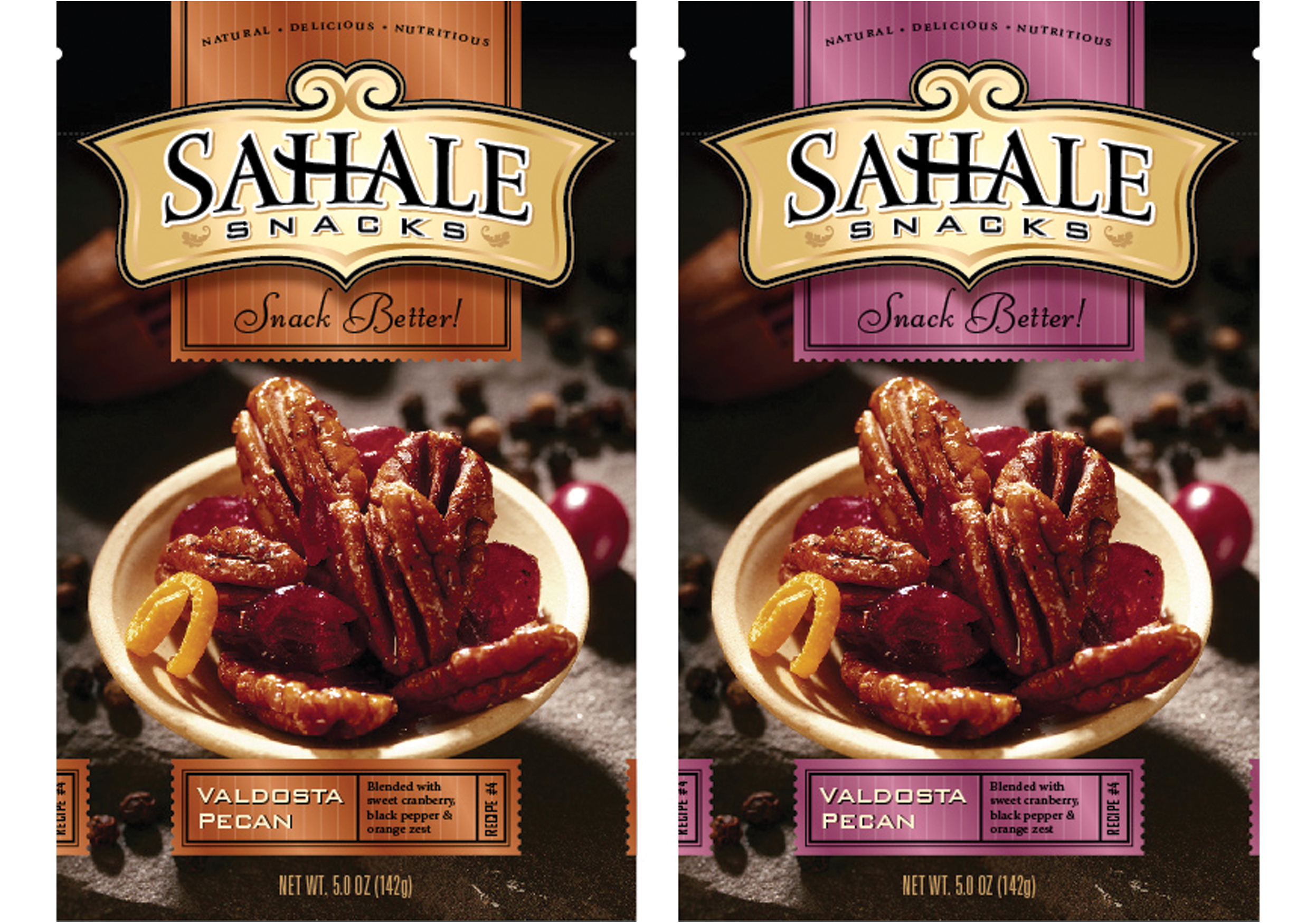
Brand Analysis When viewed in the retail setting, the overall impression of the Sahale package was that it was dark, quiet and overly formal looking. The brand and product name were small and hard to read. The visual cues used to distinguish between the varieties of nut blends was subtle and somewhat confusing. Combined with the exotic product names, these factors resulted in an unapproachable and slightly intimidating package.
Competitive Research To understand the challenges the brand faced, the competitive products and retail environment within the snack foods category were audited. This was segmented further into healthy, gourmet and established brands, each with its own set of category norms and visual cues. As a premium, healthy product, Sahale Snacks was in the position to create a new sub-category.

Consumer Testing A variety of consumer tests were conducted during the research phase, including an unaided package recall test. Participants were shown a Sahale Snacks package for 30 seconds, and then asked to draw and describe their own impressions of the package from memory. This exercise revealed the difficulty in recalling both the brand and the individual product name.

Establishing a New Identity An important component of any package is its brand identity. While the previous identity was understated and clean, it had the potential to be a much stronger visual brand element. Locked up in an octagon shape, it was hidden and confined. These new concepts removed it from its shape and gave it a much more active feel. New lettering styles were explored that better supported the brand message of a wholesome and gourmet product.

The final chosen brandmark incorporated the “Snack Better” tagline as well as a leaf icon to convey the natural and healthy ingredients used in the nut blends.
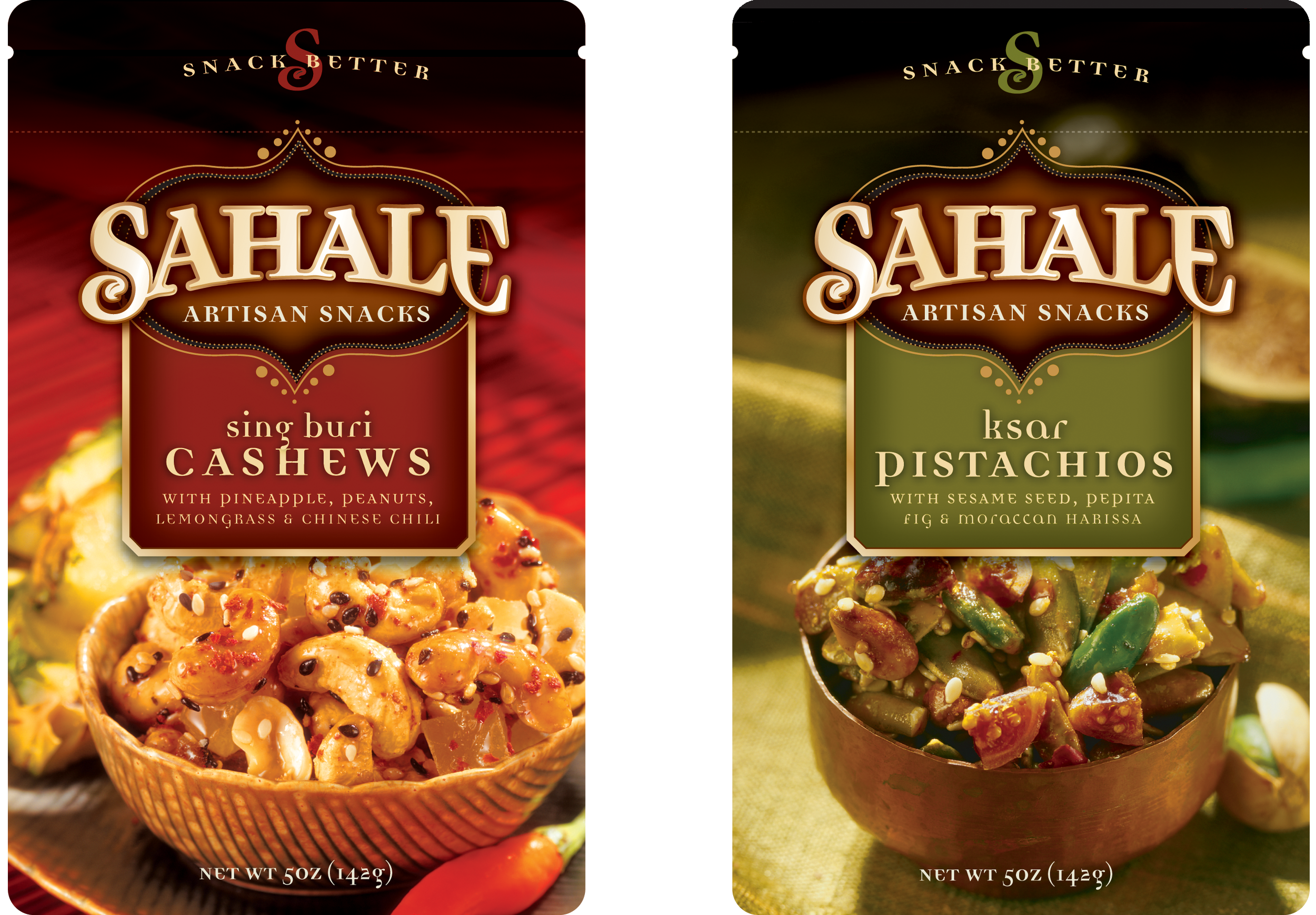
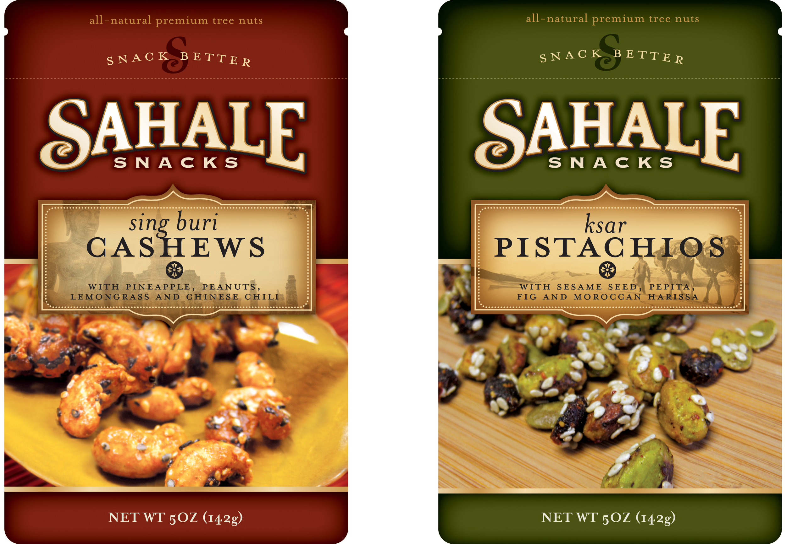
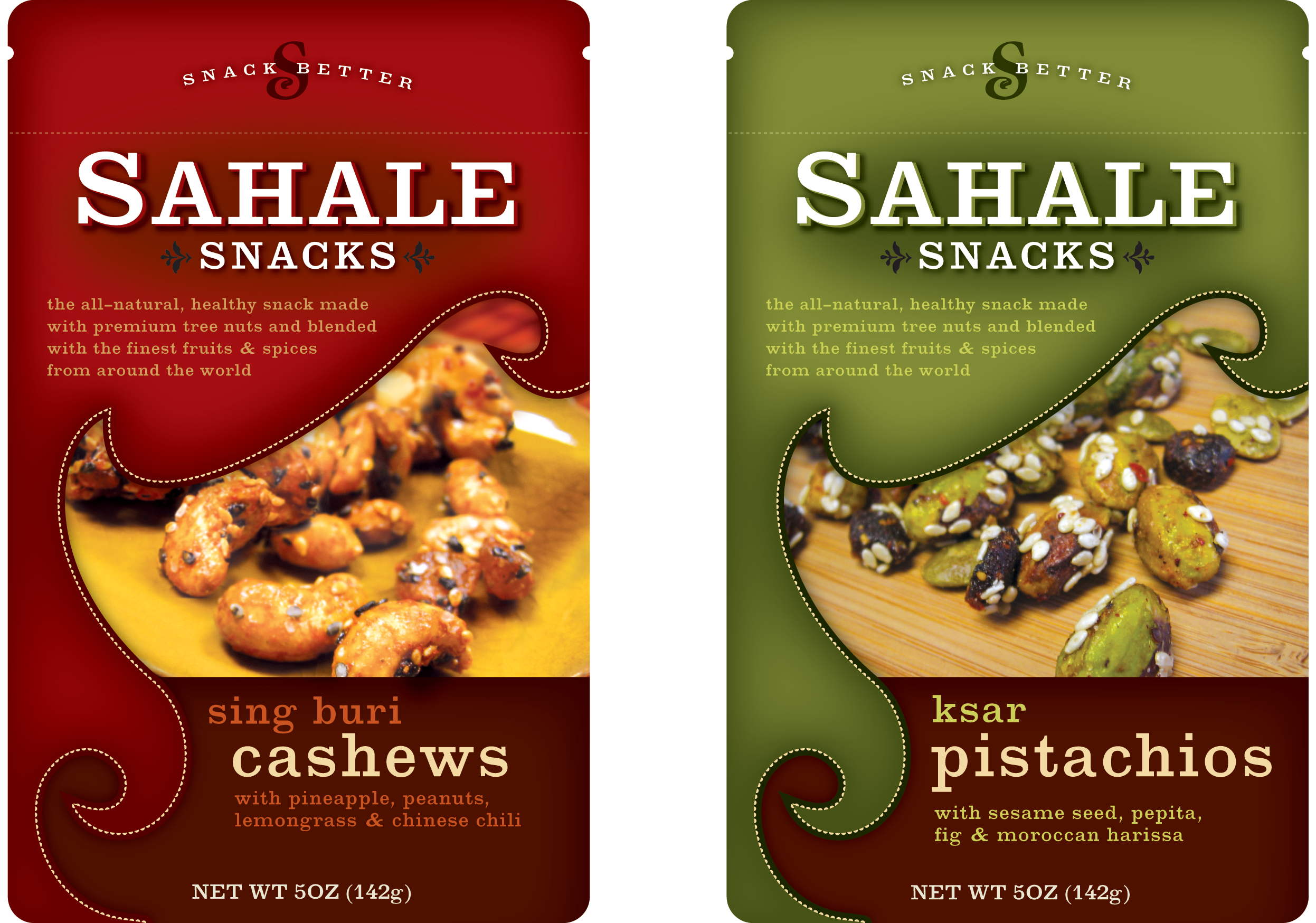
Creating the Concept A wide range of concepts were presented, starting with an evolution of the existing packaging to concepts that explored new territory for the brand. Research showed that the Sahale Snacks brand-mark should remain strong and the most prominent element on the package. Another key aspect was to call out the main nut ingredient in each blend and pair that with the exotic blend name. For example, “Ksar Blend” became “Ksar Pistachios” – a subtle, but critical change to help consumers understand what exactly the product was.

Final Design & Line Extension Once a design direction was chosen, the look was extended to other varieties in the product line. A much stronger color-coding system was created in a horizontal band that gave each variety its own distinct look, yet also established a unified visual system. The overall look of the new design was brighter and more approachable. The Sahale Snacks brand was clearly communicated and a consistent, clear visual architecture allowed for growth within the product line as well as the introduction of other sub-brands. The pay-off? Ti was recently voted the #1 best-selling train mix in the U.S.